By continuing to use our site, you agree to our Terms of Service and Privacy Policy. You can learn more about how we use cookies by reviewing our Privacy Policy.

Premium Child-Resistant Packaging Branding: How Safety-First Design Elevates Brand Perception
- September 21, 2026

Premium brands invest considerable effort into how their products look and feel.
They refine color palettes, logos, typography, photography, messaging, formulations, and customer experiences. But there is one physical element that can either reinforce all of that work or undermine it immediately:
The package.
For brands operating in safety-sensitive categories, premium child resistant packaging branding creates an opportunity to combine protection with presentation. Child-resistant functionality does not have to look industrial, clinical, or disconnected from the rest of the visual identity.
With the right packaging strategy, safety can become another signal of quality.
Why Premium Child-Resistant Packaging Branding Matters
A customer often experiences the package before the product.
They may see it first:
-
On a retail shelf
-
In an ecommerce image
-
In an advertisement
-
On social media
-
In an influencer video
-
During an unboxing experience
Then they physically interact with it.
They hold the container.
Feel its texture.
Open the closure.
Inspect the label.
Use it repeatedly.
That makes packaging one of the few pieces of brand communication that customers continuously touch.
For premium products, generic packaging can create a disconnect.
The marketing says premium.
The product photography says premium.
The price says premium.
But the container looks like every other product in the category.
Premium child resistant packaging branding helps ensure the physical product delivers the same message as the marketing around it.
Child-Resistant Packaging Doesn't Have to Look Clinical
Many consumers first encountered child-resistant packaging through pharmaceutical packaging.
As a result, child resistance became associated with utilitarian caps, standardized containers, and highly functional visual design.
But safety functionality does not dictate one particular aesthetic.
Modern packaging can combine child-resistant closures with distinctive:
-
Container shapes
-
Surface textures
-
Proportions
-
Materials
-
Finishes
-
Colors
-
Labels
-
Direct printing
-
Tamper-evident elements
The key is to develop those features together.
Instead of attempting to disguise safety functionality, brands can incorporate it into the product's design language.
Premium Packaging Communicates Quality Before the Product Is Used
Consumers make rapid judgments from physical details.
A sturdy container feels different from a flimsy one.
A closure that engages precisely feels different from one that feels inconsistent.
Distinctive geometry feels different from a generic commodity container.
A thoughtfully engineered package suggests that the manufacturer paid attention to the complete product.
These signals matter particularly in categories where multiple companies sell products with similar formulations or functional claims.
Packaging becomes one of the easiest ways for customers to differentiate between them.
That gives premium child-resistant packaging a role beyond satisfying functional requirements.
It becomes part of perceived value.
The Closure Is Part of the Brand Experience
Packaging design conversations often focus heavily on the container body.
But the closure may be the part of the package consumers interact with most.
Every time someone uses the product, they may:
Grip it. Press it. Turn it. Remove it. Replace it. Reseal it.
That interaction contributes to the overall customer experience.
If the mechanism feels awkward or disconnected from the premium nature of the product, the brand experience suffers.
If it feels intentional and well engineered, the closure itself reinforces quality.
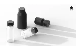
Chubby Gorilla's range of child-resistant bottles demonstrates how brands can choose between multiple formats while retaining functionality such as child-resistant closures and tamper-evident features.
Turn Functional Details Into Design Details
One of the strongest approaches to premium child resistant packaging branding is allowing functional features to contribute to the visual identity.
A textured grip does not need to exist only for usability.
It can also provide visual distinction.
A closure does not need to look like a component that was added later.
Its dimensions and proportions can complement the container.
Tamper evidence does not necessarily need to undermine presentation.
It can be incorporated into the packaging system.
These decisions make the product feel cohesive.
Instead of the container being designed by the marketing team and the closure being selected by the compliance team, both can contribute to one complete product experience.
Custom Packaging Helps Brands Move Beyond the Commodity Look
A premium brand rarely wants to look interchangeable with competitors.
That is where customization becomes particularly important.
Chubby Gorilla offers custom packaging solutions that include options such as custom finishes, direct printing, and labeling.
These capabilities allow brands to treat the package as part of a wider visual system.
For example, companies can think about:
-
Container and closure color combinations
-
Transparent versus opaque finishes
-
Direct-printed branding
-
Label architecture
-
Product family consistency
-
Texture
-
Shelf recognition
-
Photographic appearance
The result is branded child-resistant packaging rather than a generic container carrying a premium label.
That distinction becomes increasingly important as markets become more competitive.
Premium Packaging Is Also Marketing Content
Packaging no longer exists only on shelves.
It appears everywhere the product appears.
That includes ecommerce listings, social media posts, advertisements, product launch videos, influencer content, email campaigns, landing pages, retailer catalogs, and customer reviews.
This means packaging is effectively part of the content strategy.
Distinctive containers can help brands become recognizable before consumers even read the label.
Shapes become visual identifiers.
Textures create photographic details.
Colors establish product-family consistency.
Unique closure systems create differentiation.
The better the packaging looks both physically and digitally, the more useful it becomes as a marketing asset.
The Spiral Approach: Making Texture Part of the Identity
Surface design can be particularly effective because it creates differentiation without relying entirely on printed graphics.
Chubby Gorilla's Spiral Shot Bottle series shows how a spiral-textured finish can contribute both grip and visual identity.
This type of structural detail can help brands stand out even when products are viewed from a distance or displayed alongside competing packaging.
It also demonstrates an important principle:
Premium packaging does not always require adding more decoration.
Sometimes differentiation can come from the package itself.
Packaging Can Reinforce Trust
Premium branding is not purely about appearance.
It is also about confidence.
Customers pay more for brands they believe have made more deliberate choices.
That might mean better ingredients.
Better manufacturing.
Better customer service.
Better materials.
Better product design.
Packaging safety fits naturally into that expectation.
Child-resistant functionality can demonstrate that the brand has considered how products will exist inside real homes rather than focusing only on how they look in advertisements.
Tamper-evident features can similarly reinforce the idea that product integrity matters.
This turns safety into part of the premium brand promise.
The message becomes:
Every detail was considered.
Safety and Branding Should Be Developed Together
Brands get better results when packaging is considered early.
If packaging decisions are delayed until the end of product development, teams may discover that their preferred brand design does not fit the available container.
Labels may need to change.
Proportions may feel wrong.
Colors may clash.
Closures may visually overpower the package.
Packaging may not photograph the way the creative team expected.
Early collaboration gives product, branding, compliance, and packaging teams more freedom.
They can evaluate safety requirements while simultaneously considering how the product should look, feel, open, close, store, photograph, and display.
Creating a Complete Premium Packaging System
Premium packaging should ideally achieve three things at once:
Protect the product.
Support the user.
Represent the brand.
That means evaluating more than the container itself.
Brands should think about the complete system:
-
Closure
-
Container
-
Liner
-
Tamper evidence
-
Label
-
Print
-
Finish
-
Product compatibility
-
Shelf appearance
-
Consumer handling
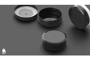
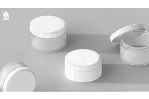
Chubby Gorilla's containers with liners and tamper-evident options provide one example of packaging where multiple functional elements are integrated into the package.
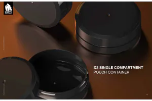
Brands looking for additional configurations can also explore Chubby Gorilla's X3 Pouch Container, which combines a child-resistant closure system with customization possibilities.
Conclusion: Safety Can Become Part of Premium Positioning
The strongest brands do not treat packaging as something that simply contains the product.
They use it to communicate. Shape communicates. Texture communicates. Materials communicate. The way a closure feels communicates.
Even the safety features communicate something about how seriously the company takes its product.
That is why premium child resistant packaging branding can be much more than a compliance exercise.
When child resistance, tamper evidence, customization, and structural design are considered together, the package can become one of the strongest physical expressions of the brand.
Chubby Gorilla's range of packaging solutions gives brands multiple ways to combine product protection and functionality with a distinctive identity—helping safety-first packaging look and feel like it belongs to a premium product.
FAQs About Premium Child-Resistant Packaging Branding
What is premium child resistant packaging branding?
Premium child resistant packaging branding combines child-resistant functionality with the design elements that influence how customers perceive a brand, including container shape, closure design, colors, finishes, texture, printing, labeling, and overall user experience.
Can child-resistant packaging look premium?
Yes. Premium child-resistant packaging can combine safety functionality with distinctive shapes, textures, finishes, colors, and branding. Child resistance does not mean every package needs to follow the same visual style.
Why does branded child-resistant packaging matter?
Branded child-resistant packaging helps the physical product reinforce the same premium positioning communicated through the website, advertising, retail presentation, and other brand assets.
Can child-resistant packaging be customized?
Customization depends on the packaging system and supplier. Chubby Gorilla offers custom packaging capabilities including special finishes, direct printing, and labeling to help brands align their physical packaging with their wider identity.
Should branding or child resistance come first?
Neither should be treated as an afterthought. The strongest premium child resistant packaging branding strategies consider safety, usability, compliance requirements, and visual identity together during product development.

Share on Facebook

Share on X

Share on LinkedIn
Comment(s)
Recent Posts